You are currently browsing the archives for the Advertising category


FREE LOGO WINNER for Adopt-a-Child Belleville, Prince Edward County & Hastings Fundraiser

Congratulations from Engine Communications!


The FREE LOGO WINNER for the Adopt-a-Child – Belleville, Hastings and Prince Edward County draw is Mary @ Crust and Crumb Bakery!

Thanks for helping to keep kids warm this winter! We’re looking forward to creating a VERY TASTY logo for you!

See Branding here. The possibilities are endless!


Engine Communications Knows Schools

It’s a numbers game these days. Let us help you get your numbers up with fresh, new and exciting marketing tools to help your school get noticed!

See our newsletter for schools.

Look who just got a website makeover! See before and after transformations.

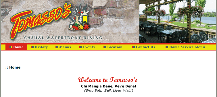
Tomasso’s Casual Dining Before…….


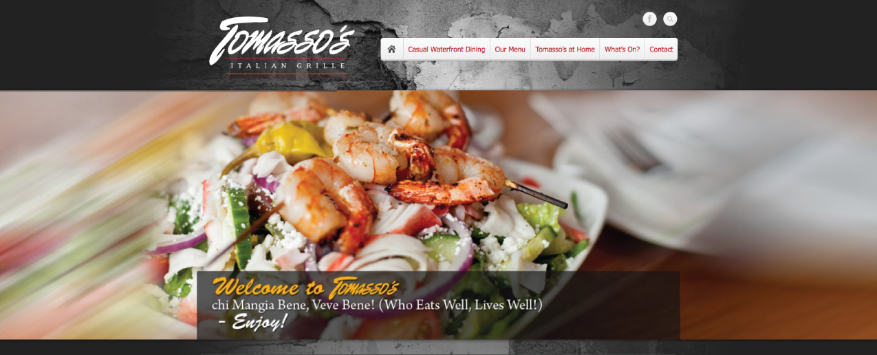
Tomasso’s Italian Grille After…..

 …man it was hard working on our fav restaurant site looking at these yummy food pics. Congrats to the Kotsovos family! It’s been our pleasure.
Visit the site. Check out their Facebook Page.
 

 MKR Dental Cabinets Before……


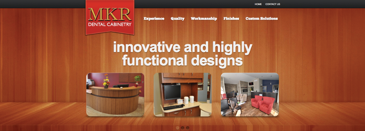
MKR Dental Cabinets After…..

 …what a great bunch over at MKR. Thanks for the smiles Richard. Congrats on
your new website. Visit the site.

Is your website really working for you? Learn more>

 Yes, you too can have your site kicked up major notches. Let’s chat!

Summer Olympics 2012

London 2012 Olympics LogoSummer is just around the corner, and that means that the Summer Olympics are too (July 27 – August 12). I just received an enewsletter from BrandsoftheWorld.com and I was reading about all the hype surrounding the logo created for the games held in London, England this year. According to www.spiked-online.com, criticism about the logo include: “the design sucks. It’s just too difficult to read the numbers ‘2012’. They are barely distinguishable as jagged, cut-out shapes, and the colours are garish. Meanwhile, the Olympic rings… have been shrunk to a tiny detail and treated in a single colour.” You are welcome to read the entire article here to get all the juicy details.

A couple of years ago we wrote a blog post about historical olympic logos and we asked what your favorite logo was. I’m curious what your thoughts are on this latest Olympic logo! I had a look at the ticket design for the games as well, and I can honestly say that I quite like them! I love the bright colours and I think that they have echoed the “jagged, cut-out shapes” and “garish” colours quite nicely in the design! Your thoughts?2012 Olympics Tickets

View them here

Funny Little Boxes

QR Codes by Engine Communications

QR Codes by Engine Communications

You may have seen these funny boxes and wondered what they are or perhaps you’ve used them on your Smart Phone. They’re called QR codes and they’re everywhere!

QR is short for Quick Response. What do you need to know now?

They send Smart Phone users directly to anywhere that is online. Engine creates customized versions of these QR codes. We’ve been using them for quite awhile now on signage, auto graphics, magazine ads, posters and more.  We get to play with colours, sizes from tiny to huge and have have fun hiding cool images inside of the boxes. While these funny little boxes can be great, let’s remember to give how we use them, a great deal of thought. Used correctly, your Online Marketing World can expand substantially.

Yes, we’ve seen them used incorrectly:

An example of using QR codes incorrectly? We’ve seen QR codes placed on websites. Huh? Ummm, no, that’s not the idea. Think print. You see, the idea is to send people to your website or other online content anywhere on the web. Driving traffic to your online content, continuing your marketing message and increasing business.

QR Codes? That’s Smart!

Gift Cards a Win for Non-Profits!

It’s funny how one idea leads into another. Being in the creative field, that’s often how it works. We brainstorm, research and throw ideas around all the time. Sometimes we begin leaning towards one direction, but then, more ideas come to mind that lead is into another. The end result is a culmination of all of our wacky, and at times, pretty clever thoughts and ideas.

That’s how we ended up with the idea of helping local community agencies.

While creating business Christmas gift certificates for our marketing services, we were going through the details on what could be done and how it should be redeemed, and all of a sudden, we realized that non-profits could use some help too.

And so, the birth of the gift card for non-profits came to fruition. While this is late in the season, we decided to go ahead anyway, with the aim of expanding the concept further in the future.

Then we thought, ‘Hey we would like to help too!’ Why not create a contest for the agency that receives the most donations in gift cards? We looked in our pocketbook and our production schedule and decided that we could donate $5000 worth of free services to the winner.

So, if you’re looking for a new idea for giving this Christmas, something that counts to make a difference in your community, you can now give the gift of professional marketing, consulting and creative campaigns to your favourite local charity or not-for-profit organization!

Contest closes January 31st, 2012. We hope you can participate, spread the word and we certainly also hope you like the idea. Wonder what we’ll think of next!

Gift Card for Marketing
Click here to check it out>

Listening to Your Competition

Do you ever feel like everywhere you look, competitors are saying the exact same things in their advertising? There are merits to knowing what your competition is doing, in any industry it is crucial to know what is out there and make sure that you are offering a competitive product or service at competitive rates. What most people do not realize is that focusing too much on your competition can actually cripple your businesses and accomplish the opposite of what you are trying to do.

What happens all too often, especially in smaller cities, is that people have a tendency to copy. I’m not saying that they go out there with the intention of mimicking, but they become so focused on what others are doing that they forget to innovate.

I was reminded of this concept when I went to the store to compare tablets, the iPad 2, Blackberry Playbook and others. What became apparent the more I looked and researched was that Apple was focused on their business, on being the best they could be. While it seems everyone else is simply try to keep up with competition.

Makes me wonder, what could we accomplish if everyone stopped trying to be like everyone else, and just focused on being the best they could be. Now that gives you something to market!

Great Campaigns Produce Great Results

As a fan of the Song of Ice and Fire series of books by George R. R. Martin, I have been watching the development and promotion of the new TV series: Game of Thrones, with a keen eye.

HBO’s promotional campaign is great example of a successful integrated marketing campaign. From seizing the throne, to free bicycle throne rides events and then integrating it with a Facebook, blog and Twitter campaign, HBO had a great promotional campaign.


They placed giant throne replicas around major cities like New York, San Francisco and Los Angeles. Then, people got their picture taken which were then posted on Facebook and Twitter as “seizing the throne.”

This strategy is great for many reasons. First, giant thrones in a major public area will create attention and buzz from traditional media and word-of-mouth. Second, posting the pictures on Facebook gets people to spread the word to family and friends which further promotes the new TV show. Third, people will then post and talk about these events occurring (such as this blog!)

These promotions were highly successful judging by the 4.2 million viewers who tuned into the first episode.

Although HBO had a large budget, they used it efficiently. By showing these events across all possible mediums, they used their dollars wisely. Make sure you do the same when planning and promoting your events.

Tumblr: The next Star?

Recently I have begun to experiment with a new (2008+) and growing media tool: Tumblr. The tool combines Twitter and Blogging to create a “micro-blog.” Instead of short posts on your WordPress or Blogger account, you post small updates on your Tumblr page. These updates can be larger than Twitter’s 140 character limit, but users are encouraged to keep updates small. Multimedia can be uploaded to a page directly, much like a blog or a Twitter pic link.

Tumblr wants you to Save Twitter for short links and updates, blogs for longer discussions and Tumblr for longer than Twitter updates but not long enough to merit a new blog post.

On one extreme there are blogs (long, in-depth) and the other extreme is Twitter (short and shallow). Tumblr strives to hit the golden mean and let users post medium posts, enhanced with embedded multimedia.

My favourite feature is the news feed, which standard blogs do not have and acts just like the Twitter feed. Users can “reblog” their favourite posts directly from the news feed.

Does it work? From what I have seen so far, Tumblr is easy to use and is quite unique. If it was not for their technical instability I think Tumblr would be the next big social media platform.

The instability means that users can never know whether their posts will be posted or lost. They won’t know if people will even be able to access their page when Tumblr servers go down. Tumblr will not continue to grow if users become frustrated with technical glitches.

Tumblr is a neat tool and has a vibrant community if they can fix their issues I can see it becoming quite popular. I definitely recommend checking it out and see if it is useful for you and your organization.

Is Tumblr the way of the future, or is there some other site out there that is thriving and growing? Let us know what you think. You can check out my work-in-progress Tumblr at: troyvstew.tumblr.com

Hire a Blind Person

I’ve recently come across what may be some of the most controversial television advertisements I’ve seen in a while. They are from the Norwegian Association of the Blind, and while I can appreciate humour in advertising, I find this brand of self-deprecating humour to be in poor taste. Sure, they accomplish their goal of making the viewer consider the advantages of hiring a blind person, but it almost feels like they’re encouraging the exploiting of handicapped people.

What are your thoughts; are these ads in good taste – or do you think the only reason they get away with showing these ads on the television is because the blind people they are talking about can’t see them? Comment below…