Yesterday, the Olympic torch passed through our fair city, with thousands of Quinte residents crowding the streets for a glimpse. Despite the fist shaking that ensued over congested traffic, the Olympic spirit prevailed, and a sense of unity and pride was in the air.
(Take a look at the video our friend Trevor Crowe, of Crowe Productions took yesterday!)
The Olympics is an event of, well, Herculean proportions (pun very much intended). And there’s more to it than simply the games. Whether it’s in city planning, architecture, uniforms and accessories, logos or branding, the Olympics is as much about design as it is about the sport. Since its rebirth in 1896, both summer and winter games have seen various attempts at capturing the Olympic spirit visually.
Rumour has it, we like design around here as well. So we thought we’d take a look at some past logos, in honour of the torch run, and let you know our favourites.
 Fillmore’s Picks
Albertville, 1992 and Calgary, 1988.
Kathy’s Picks
I prefer Helsinki Summer 1952 for the sole reason that it definitely has the “retro” feel. However, for fun colour and movement I prefer Barcelona Spain – I’d love to go to Spain one day. Calgary 1988 hits me in a nostalgic way because I remember watching Elizabeth Manley win silver in women’s figure skating. It was so exciting!
Bryna’s Picks
 For purely nostalgic purposes, I agree with Kathy regarding the Calgary 1988 logo. I think it was the first Olympics I was really aware of, and it held a certain grandiose mystique in my seven year old mind. Plus, I liked those bear mascots!
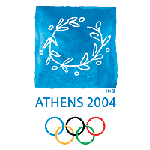
As a grown up, I love the Athens 2004 logo, but I think it lacks the movement that you might associate with a good Olympic design (ie. Barcelona, Nagano, even Torino). But I still think it’s gorgeous so it’s my favourite.
Kerry’s Picks
 I am quite torn as to which one I like the best. I would have to say that it is between three: Lake Placid Winter 1932 (really love the feel of this one and the image of the skier); Sapporo Winter 1972, and Calgary Winter 1988. Funny how they are all winter ones! If I absolutely had to pick, I guess it would be 1972–awesome color combo with the silver and red, it looks crisp and clean (not too busy like some of them) and easy to understand. Love the snowflake!
 Shaun’s Picks
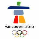
Vancouver 2010 as it’s the most sophisticated/modern design of late. Taking the colour from the rings was smart, and they didn’t overdo it with the fonts.
For a complete list of Olympic logo design, check out this link.
What are you favourites?
