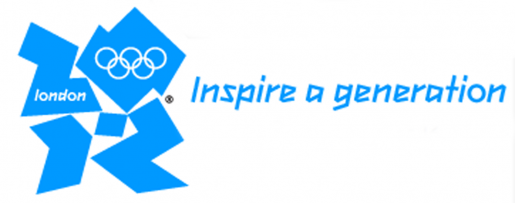
 Summer is just around the corner, and that means that the Summer Olympics are too (July 27 – August 12). I just received an enewsletter from BrandsoftheWorld.com and I was reading about all the hype surrounding the logo created for the games held in London, England this year. According to www.spiked-online.com, criticism about the logo include: “the design sucks. It’s just too difficult to read the numbers ‘2012’. They are barely distinguishable as jagged, cut-out shapes, and the colours are garish. Meanwhile, the Olympic rings… have been shrunk to a tiny detail and treated in a single colour.” You are welcome to read the entire article here to get all the juicy details.
A couple of years ago we wrote a blog post about historical olympic logos and we asked what your favorite logo was. I’m curious what your thoughts are on this latest Olympic logo! I had a look at the ticket design for the games as well, and I can honestly say that I quite like them! I love the bright colours and I think that they have echoed the “jagged, cut-out shapes” and “garish” colours quite nicely in the design! Your thoughts?


{ Comments are closed! }