You are currently browsing the archives for the Public Relations category


Tumblr: The next Star?

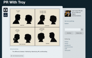
Recently I have begun to experiment with a new (2008+) and growing media tool: Tumblr. The tool combines Twitter and Blogging to create a “micro-blog.” Instead of short posts on your WordPress or Blogger account, you post small updates on your Tumblr page. These updates can be larger than Twitter’s 140 character limit, but users are encouraged to keep updates small. Multimedia can be uploaded to a page directly, much like a blog or a Twitter pic link.

Tumblr wants you to Save Twitter for short links and updates, blogs for longer discussions and Tumblr for longer than Twitter updates but not long enough to merit a new blog post.

On one extreme there are blogs (long, in-depth) and the other extreme is Twitter (short and shallow). Tumblr strives to hit the golden mean and let users post medium posts, enhanced with embedded multimedia.

My favourite feature is the news feed, which standard blogs do not have and acts just like the Twitter feed. Users can “reblog” their favourite posts directly from the news feed.

Does it work? From what I have seen so far, Tumblr is easy to use and is quite unique. If it was not for their technical instability I think Tumblr would be the next big social media platform.

The instability means that users can never know whether their posts will be posted or lost. They won’t know if people will even be able to access their page when Tumblr servers go down. Tumblr will not continue to grow if users become frustrated with technical glitches.

Tumblr is a neat tool and has a vibrant community if they can fix their issues I can see it becoming quite popular. I definitely recommend checking it out and see if it is useful for you and your organization.

Is Tumblr the way of the future, or is there some other site out there that is thriving and growing? Let us know what you think. You can check out my work-in-progress Tumblr at: troyvstew.tumblr.com

Physically Represent your Brand

As we say on our website “a brand is a powerful collection of perceptions in the mind of a consumer.” Although your brand image depends on what your consumer thinks, you can do many things to help foster a positive brand image.

A relatively easy way is to start from where you do business. Whether you are a manufacturer, small business, multinational or creative business, your location can make a lasting impression. A great location will convince people of your mission and your passion.

A great example is the BMW headquarters (seen in the YouTube video). The tower was designed in the shape of four-cylinders, which alludes to a four-cylinder car engine.

Also, as I begin interning here at Engine, the first thing I noticed is that they take their mission to heart. Positioned at a railway station, the constant rumbling, horn-blasting and bell-ringing remind me that we are here to drive businesses toward success.

It really makes a lasting and great first impression on both consumers and employees. Take a look at your business, or your place of employment. Does the location reflect your mission?

Troy is currently interning at Engine Communications as part of his Loyalist Post-Grad PR Program.  He likes anything to do with PR, social media and technology.  A UWO graduate, he is always looking at new ways of doing things. His blog can be found at: troyvstew.wordpress.com

Hire a Blind Person

I’ve recently come across what may be some of the most controversial television advertisements I’ve seen in a while. They are from the Norwegian Association of the Blind, and while I can appreciate humour in advertising, I find this brand of self-deprecating humour to be in poor taste. Sure, they accomplish their goal of making the viewer consider the advantages of hiring a blind person, but it almost feels like they’re encouraging the exploiting of handicapped people.

What are your thoughts; are these ads in good taste – or do you think the only reason they get away with showing these ads on the television is because the blind people they are talking about can’t see them? Comment below…

How to Design Your Website for 2011 and Beyond

The web is an ever-changing symphony of technologies and trends, that when blended together in harmony, produce great experiences in the form of those websites that populate our bookmarks list and the links we share with our friends. This past year (2010) brought us the promise of a paradigm shift and laid the foundation for some major changes to the way we think about web design. For the first time in the history of the web, we have to assume that any content must be accessible from devices other than computers and intentionally plan for mobile devices.

Shifting our thought from designing a separate website for mobile devices to designing mobile devices for the web, has allowed us to create new technologies like geolocation to tailor web content to your geographic location automatically (Foursquare and Facebook Places use this). There has also been a sharp decline in the use of Adobe’s proprietary Flash plugin to display essential content or navigation because it has been handicapped by a severe lack of support in the mobile marketplace.

So what lies ahead on this continuing evolution of web design, and how can we plan to design our sites with 2011 (and 2015) in mind? Here are a few trends I see in the near future that are mostly simple design choices within the reach of any new website, that will make your site a trendsetter.

Design With Mobile Devices in Mind

We’ve experienced an almost unbelievable explosion in the use of mobile devices for browsing the web with smartphones, but with the introduction of tablet computing into the mainstream last year with the iPad and many competitors soon to be on the market. We know this is only the tip of the iceberg, so how can we design with mobile touchscreen devices in mind?

Don’t rely on mouseovers for essential content, like navigation
Touchscreen devices have two states: touching, or not touching. There’s no ‘hovering’ with a touchscreen, so interactive elements that rely on a mouse hovering over a link (a rollover) simply won’t work on a touchscreen. The good news is that almost any rollover can be converted to a click toggle instead just by making a few minor alterations to code.

You should steer away from relying on rollovers for navigation or displaying your information, but having rollovers for animations or effects is still okay as long as you assume no touchscreen users will be able to see these effects and they don’t alter their ability to navigate the site.

Make your design narrow
Many sites suffer from being too wide to be comfortably readable. The line-length of text that works best for legibility is somewhere between thirty-five and one hundred letters long. Anything longer is simply a chore to read, and anything under thirty-five letters wide causes eye strain. Try building your site to fit within 960 pixels wide, think of the width of a sheet of Letter-sized paper. Remember you can scroll up and down a website all you want, but the wider the design is the hard it will become to navigate. Both mobile and desktop users can also see a narrow website equally well.

Dont rely on Flash so long as it can be avoided
Flash is a proprietary plugin made by Adobe, and because of this there is support only on the operating systems which Adobe chooses to plugins for, and with varying levels of support at that. There is no Flash plugin for most mobile platforms and even when Adobe has created a plugin, there have been many issues with running Flash on mobile touchscreen devices because most Flash designs cannot capture the multiple pointers simultaneously which breaks the multitouch gestures used on touchscreen devices.

Keep in mind that a phone or tablet has only a fraction of the computing power of your computer and can’t handle the complex animations that your computer can even if it happens to have Flash. With this in mind, most uses of Flash aimed at mobile markets should be lightweight, and almost everything that can be done in Flash that is lightweight can also easily be achieved without using Flash and simply using standard web technologies like HTML5, CSS3, and Javascript that almost all mobile devices (as well as computers) already have. Designing interactive elements in standard web technologies lets you display your content without plugins and without breaking the multitouch gestures you use to navigate touchscreen devices.

Use Minimalist Design to Communicate Better

Use bold photography
A coming trend for web design is featuring bold photography, even as large as a site background. If a picture is worth a thousand words then why not make those pictures speak the best of you and your brand? A poor photo takes the same amount of resources to view on your site as a great photo, but a poor photo can hurt your brand. A wise idea if you haven’t done it already, is to have professional-quality photos taken of your product/location/people. These will come in handy for any current or future web and print design project you might want.

Use a limited colour palette
We have the ability to use millions of colours on the web, but more isn’t always better. Picking two or three well-chosen colours that coincide with your branding will really help set you apart from other websites, and make a memorable impression on your readers. A simple layout and limited colour palette will clearly define your brand and help unify the tone of your content.

Use typography artistically
Until recently websites were limited to displaying content in the fonts installed on each readers own computer. Since OS X, Linux, and Windows all come with different fonts pre-installed, there were only a handful of fonts in common between all computers that you could use with the confidence that it would show up the same universally.

Lately, new technologies have allowed designers to use any font they wish on their website, whether the readers have it installed on their own computers or not. Starting today, we will see an explosion of the use of creative typography on the web, and a much more mature feel to web design in general.

Use Playful Design to Connect With Your Reader

Memorable domain names are better than shorter domains
Having a domain that is easy to remember and say over the phone to a friend is far better than a brief domain that is easily forgotten or hard to communicate to others. Saying YourTableIsReady.com is easier than RestaurantReviewsOnt.com

Don’t be afraid to be whimsical with your content
The web is different than print or radio, and the attitude is much more personal and playful. Try writing your web content like a conversation instead of a loan application. A little playfulness and whimsy goes a long way to making reader feel connected to you and your brand.

Try saying “Thanks for sending us a message” instead of “Form submitted successfully”, or “Nothing makes us happier than hearing from you, if you want to get in touch with us please fill out the form below” instead of “Contact form below, fields containing an ‘*’ are required”

Final Thought

The number one business trend according to a number of successful web entrepreneurs, is hand-written thank-you notes sent by mail. Don’t forget that the best advocate for your brand is you, and the time you take to connect with your readers. If mailing personal thank-you’s is out of reach for you, a heartfelt and grateful email can help build friendship and loyalty between you and your readers too.

Best of luck to you this coming year from Engine Communications!

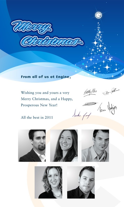
Merry Christmas

We will be closed December 23rd, 2010 at 5:00pm – January 4th, 2011 at 9:00am. Enjoy the Holiday!

GAP Logo Controversy

This holiday weekend while online I saw an article about the new GAP logo that was revealed on October 4th and the criticism the popular retailer is receiving for it. Now that I’ve had a chance to compare the two logos, I think that I am partial to the old one, only because it is what I grew up with. It gives me a warm fuzzy feeling of happy days and buying cool clothes…..it brings me back to my University days. I guess I’m not the only one feeling this way. According to the Yahoo article this morning, this comment from a Facebook user is typical of the online response: “By changing it, you’ve completely destroyed what it took 20-plus years to build.” I wonder what is the average age of those who dislike the new logo. I’m curious…which one do you prefer?

Check out the article!

– Kathy

Pay with your phone

In some cites you no longer need to purchase tokens or a metro pass for public transportation. Visa has teamed up with Apple and Blackberry to create an application that will charge transit fares to your Visa by simply waving the enabled smart phone in front of a reader. The idea behind this is to creates faster movement through some of the worlds busiest transit terminals, and also be more convenient for the customer. This means no more line ups to buy tokens or tickets. Currently in North America it is being tested in New York City. I have no doubt that this trial will be a success. It really only takes one visit to New York’s Port Authority during rush hour to see that anything that could possibly speed up the process would be a welcomed change.

For more details check out this article.

– Sandra

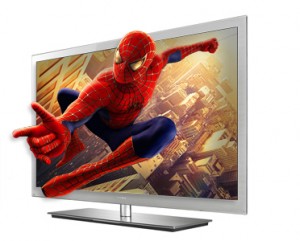
The 3D TV Phenomenon

By now just about everyone has seen a 3D movie in the theatre, it’s pretty hard to avoid seeing one anymore. We’ve been hearing about 3D television for over a decade now, but finally it is available in nearly every store you walk into. I was recently out looking at televisions and was amazed at how well these TVs, with the flick of a switch, create a 3D cinema-like effect. As I was looking I began to wonder what it would be like to watch a 3D television every day — would my eyes adjust to them? Perhaps I am just not used to it yet, I feel a little off balance after watching a 3D movie. I got to wondering what kind of strain it would put on my eyes long-term. I considered all of these things, even though a 3D TV is far from being in my budget.

I decided to head to trusty Google and see what people were saying about it. I was shocked to find quite a lot of controversy over the issue. Apparently there have even been warnings issued by the manufacturers to avoid use if you are in poor health, tired, or drinking alcohol, under the age of 6 or over the age of 65. I’m sorry but that is just not cool, the only time I watch TV is when I am tired or not feeling well.

Customers are also cautioned to immediately stop watching 3D pictures and consult a medical specialist if they experience any of the following symptoms: (1) altered vision; (2) light-headedness; (3) dizziness; (4) involuntary movements such as eye or muscle twitching; (5) confusion; (6) nausea; (7) loss of awareness; (8) convulsions; (9) cramps; and/or (10) disorientation. Parents should monitor and ask their children about the above symptoms as children and teenagers may be more likely to experience these symptoms than adults.

Groups considered to be at high-risk for these side effects are; pregnant women, young children, teens, the elderly, people prone to seizures or stroke, people prone to dizziness or motion sickness, people with eye problems, people who are out of shape, and people who have been drinking. It has also been attributed to damaging people’s depth perception.

At this point I got to thinking, am I talking about television or the side effects of medication?! Cool as 3D is, and as much as I enjoy it in the theatre every now and then, maybe its best to wait a little while longer with my HDTV and let this technology develop. In the mean time, perhaps we should pass a law about driving under the influence of TV.

– Sandra

Facebook – An Outlet For Narcissists?

While on lunch today I was reading an interesting article on Yahoo about Facebook. According to an article by Andy Blatchford of The Canadian Press, a new study of Canadian University students suggests that Facebook is a magnet for narcissists and people with low self-esteem.

The article states that people who have a low self-esteem or who are narcissistic spend more time on the popular social networking site than those people who have adequate levels of self-worth. Apparently, the surveys were conducted two years ago, and the findings were published last month in the journal Cyberpsychology, Behavior, and Social Networking. An interesting comparison was also made between male and female Facebook users and how they promote themselves differently.

With Facebook having an estimated 500 million users, 16 million of those being Canadians I find the results of this study very interesting. The article ends with this question: “Is it that narcissists are more likely to use Facebook, or people who use Facebook are more likely to become narcissists?”

I’m curious – what are your thoughts? Here is the link to view the article:

While on lunch today I was reading an interesting article on Yahoo about Facebook. According to an article by Andy Blatchford of The Canadian Press,  a new study of Canadian University students suggests that Facebook is a magnet for narcissists and people with low self-esteem. The article goes on to state that people who are low on self esteem or who are narcissistic spend more time on the popular social networking site than those people who have adequate levels of self worth. Apparently, the surveys were conducted two years ago, and the findings were published last month in the journal Cyberpsychology, Behavior, and Social Networking. An interesting comparison was also made between male and female Facebook users and how they promote themselves differently. With Facebook having an estimated 500 million users, 16 million of those being Candians I find the results of this study very interesting. The article ends with this question: “Is it that narcissists are more likely to use Facebook, or people who use Facebook are more likely to become narcissists?” I’m curious – what are your thoughts? Here is the link to view the article:

http://ca.news.yahoo.com/s/capress/100907/national/facebook_narcissists_insecure

– Kathy

Best Wishes, Kerry

Kerry

With so many fantastic qualities, it’s hard to define Kerry Patrick in just a few words. Exuberant? Definitely. Professional? Always. Customer driven, hard working, and downright fun – the woman has it all.

That’s why we feel so torn right now. On one hand, we’re happy for Kerry, on the other hand we are sad to see her go. Effective April 29, 2010, she assumes her new position as Account Executive for Mix 97, CJBQ & Rock 107. We’ll miss her laughter, warm disposition, and let’s face it – her culinary skills. Kerry can cook! If she wasn’t in marketing, she should definitely be a chef.

Continue reading →