You are currently browsing the archives for the Design category


Now that is interactive

A clothing/fashion store opened last June in Times Square. What caught my eye was the way they created a billboard that not only drew a crowd, it (at least on some level) interacted with them. From NYClovesNYC:

“The enormous store provides Times Square with a high-tech 61-foot digital billboard featuring virtual models who interact with the mesmerized crowd in front of the store, sometimes taking a Polaroid photo of the crowd and showing it to them, or picking up an individual from a crowd and turning him into a frog by a kiss or dropping him into a shopping bag.”

Times Square Billboard

It kind of reminds me of the Jaws movie billboard in Back to the Future II

Did Hollywood have it right? Is this the future of environmental advertising – or is it just a gimmick?

– Shaun

Nice concept but…

I saw this a few days ago:

I thought it was pretty clever at first–salt as dandruff–cool concept. Then I thought “Wait a minute, who is going to put that on their food?!” I mean, they put these in restaurants. What restaurant wants something so unappetizing on their tables? I can’t imagine how this would be good for business (at least for the restaurant).

To me, this is an example of a concept that although clever, just misses the mark. I would be interested to hear what others think.

Journaling

While I was writing my blog last week, I was thinking that it was sort of like writing in a diary. Remember those growing up? Although, the new term for this is called “journaling” – writing down your thoughts and experiences. By getting your thoughts out of your head and putting them on to paper, you gain insights you would otherwise never see. This process can enhance both your personal and professional life.

A diary is more of a descriptive list of the day’s events, and a journal is more of a reflection of the day’s events with expressed emotions. Both are “old school” in the sense that you are using pen and paper instead of a computer. “New school” is Blogging, or creating an online diary. www.blogger.com is a great site to visit if you are thinking about creating a personal online journal.

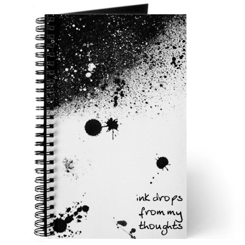
This prompted me to buy a diary at Chapters this past weekend, and I wrote my first entry already. I was flip-flopping between two different covers when choosing it, however. If you’re like me, and you like books with nice covers, www.cafepress.ca has a large selection of journals to choose from with very cool covers – whatever you fancy. They come with a wide variety of papers to choose from, as well as one-of-a-kind journaling designs. You can also look for journaling gifts and custom journals to make your writing experience more meaningful.

There are also online tools to help make your journal experience a positive one. www.journalingtools.com is a Canadian site that does this. Very interesting. My weekly Blog posts might benefit by me reading about some of these tools. We’ll see. I’m sure that some entries will be better than others!

—Kathy

A personal touch

With the advent of all things digital, have we lost some of the personal, handcrafted touches that were once common? Our communication in particular has become almost entirely email and/or Social Media based. I am not saying this is a bad thing, for it is extremely convenient, effective and efficient.  So how do we make our communication have more personality?

Well, if you are heavy into Facebook, there is always Pimp My Profizzle. It is a fun way to add some flare to your profile pic. But what about good-ol’-fashioned email. Is that boring signature just not enough? Pilot has found a way to take care of that.

I realize they are using this to sell pens, but what a cool idea.

As a designer I am always looking for ways to personalize things and communicate in a way (usually visually) that expresses something unique about someone or something. I wonder where that will take us next…

A Funny Billboard

I was driving home from work the other day and I laughed out loud when I saw a billboard for Gay Lea Spreadables. I had to pull over and take a picture of it! Take a look – who hasn’t had this happen to them? Too funny. I was curious and checked out their website gaylea.com. They have a sponsorship program on now which supports the Daily Bread Food Bank – a non-profit, charitable organization that is fighting to end hunger in our communities. You know, it’s not the first time I’ve been impressed by a billboard on my way home from work.

Print media isn’t just limited to the office. Out-of-Home products such as posters (or billboards), superboards, transit shelters, wall murals, bus, subway and streetcar advertising are all powerful ways of reaching today’s consumer. CBS Outdoor is who we send all of our outdoor billboard designs. For information on any of the products they have please visit cbsoutdoor.ca

I remember one billboard in particular that proves the effectiveness of strategic planning when it comes to choosing a location. A few months ago, McDonald’s was advertising FREE COFFEE when Tim Horton’s had their “Roll Up The Rim” contest on. The billboard for the free coffee was located right across the street from a Tim Horton’s. I thought that was genius! Needless to say, I went to McDonald’s for my coffee those two weeks (and maybe a couple of lunches). I even went onto their website and was reading about their nutrition information and community involvement, and I now have a better opinion of the restaurant chain. Tim Horton’s has similar information on their website, and the Gay Lea website has an environmental sustainability report available to view. It’s nice to see large business caring about their community.

Billboards speak to each consumer differently. What I find funny, or smart, might seem silly to someone else. That doesn’t matter, however. The fact remains that the billboard DID speak to me, and I’m still thinking about it! Have you seen any unique billboards lately? I’d like to hear about it.

If you’d like to see the billboards Engine has designed, you are welcome to view our portfolio online.

—Kathy

It’s All About Colour

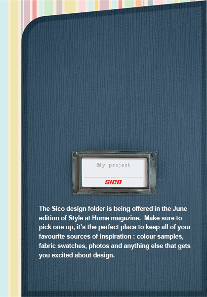
I’ve been wanting to change the colour of my fireplace for a while now. As I was flipping through the newest issue of Style at Home magazine, I saw an interesting advertisement for Sico paints called “My Project”. It actually engages the reader – there is a scrapbook folder inserted into the magazine which you can pull out and keep to help organize all your ideas for your next design project. Visit  www.styleathome/sico to view the folder. It got me thinking.

As a designer, the first place I turn to for colour is the Pantone swatch book. A couple of years ago I chose a spot colour pms #4515, which is equivalent to Benjamin Moore’s “Sombrero”. This time I’m thinking of going a little more dramatic and picking pms #404, or Benjamin Moore’s “Mortar” or “Nordic Grey”. Check out the 2010 – 2011 paint colour trends at www.benjaminmoore.com and www.sico.com.

Colour trends shift constantly, just like anything else, so it is important to keep up to speed on what’s new in colour. Sometimes I like to source www.colourlovers.com for fresh new colour combinations for print media. A good site for picking complimentary colours is  http://colorschemedesigner.com. The Pantone website www.pantone.com also has colour library updates at your disposal. All you have to do is become a member.

Designing for your home is kind of like print design – creating a harmonious and effective colour palette is important.

—Kathy

What is Geolocation Anyway?

Hello! Today I’m going to tackle a trend I see emerging with new technology: location-aware web browsing (geolocation).

As more people are browsing the internet on phones and mobile devices (many of which have GPS also) there has begun this challenge of finding ways to insert your geographical location into the online world (where location until now has been irrelevant) in a valuable way.

Most modern web browsers (i.e. everybody but Internet Explorer, unless you’re using Google’s ‘Gears’ plugin to add functionality) have support for geolocation already, so how will we leverage this technology in the future to shape web design? A better question is; how would knowing the geographic location of a web user allow you to serve them better?

Here are five simple ways I can see that could immediately be incredibly useful and provide tremendous value to the user

Location-Aware Websites

Suppose you were planning a trip to Bermuda and using a location-aware web browser.  With this technology I could provide information about my resort and how to contact us, for those visiting my site from outside bermuda, but if I knew that the user was in Bermuda I might offer a schedule of the activities at my resort and information that a person not on the island wouldn’t have use for.

Perhaps a shopping mall website could feature a list of the stores and services they represent on their home page when you’re away from the mall, but the moment you step inside the mall their homepage could simply become a map of the mall itself, and then provide links into the rest of the site as a secondary navigation feature.

Location-Sharing Services

This one already exists in its nascent state with services like Foursquare and Gowalla.  Right now we’re checking in at places of business (but not yet temporary events like concerts or conferences) and tracking the movement of our friends, as well as leaving geo-aware tips for the public.

At my most frequented sushi place, I left a note for the public to try certain menu items – even if they’re not my friend or if I’m not there.  Yes I might not know the person who sees this, but I could just as easily have bumped into them in person at the restaurant.

By adding geolocation to websites and sharing your location with the public allows you to ‘bump into’ strangers in your town at the places you visit and can help foster new friendships – now that is truly social media.

Directions to Places of Business

This one is simple, but incredibly useful. We’ve all seen websites that have maps that provide the location of a business, but if the browser knew your current location at all times it could provide the quickest route to that place of business, and would continue to update for you on their website as you view it and change your location.

Never see a ‘Find a Store Location’ page again; supposing the website you’re going to is a franchise it could detect the location nearest you and display that by default.

Default Language Selection

Here in Canada we live in a country with two official languages, so many sites will provide their content in the language they feel best fits their audience and provide a link to the other language.  With location-aware browsing you would be able to target the default language displayed based on the user’s location (still providing them the chance to switch languages at any time later of course).

Lets assume you’re a large corporation serving many countries; you could target your site to German language people if they are browsing from Germany, but display the default language as Chinese if they visit your site from China.

Locally Tailored Content

There is an unhealthy excess of news sites online, and many news sites fall under the same media conglomerate and simply provide an outlet for local news for one region.  Imagine if instead of your local news website, you went to the main media company website and it promoted local stories near your location, as well as national and international news.  That way everybody would be visiting and writing for the same main news website, and more money could be spent raising awareness of that one website across the country – yet the delivery of the content would be the same as your local news site.

Oh, and one added benefit – you *could* search and find local stories from anywhere because they’d all be in one location, where now they’re split up on hundreds of different local news sites even though they are from the same media company.

So there are five simple examples of how knowledge of the users geographic location can help shape the web, and allow you to serve your users better and more intuitively – and at the same time empower them in their own environment and foster development and growth of offline relationships.  This is an exciting time to be a web designer, but an even more exciting time to be alive as all this technology can be put to use right away to improve our lives.

—Tom

HTML 5 and why you should care

I have had some friends asking me about HTML 5. There has been a bit of buzz about it, so I thought I would address it and how it affects us as designers and others as clients and users.

According to Wikipedia:

HTML5 is currently being developed as the next major revision of HTML (HyperText Markup Language), the core markup language of the World Wide Web. HTML5 is the proposed next standard for HTML 4.01, XHTML 1.0 and DOM Level 2 HTML. It offers capabilities currently provided by plug-in-based rich internet application (RIA) technologies such as Adobe Flash and Microsoft Silverlight. In common usage, HTML5 may also refer to the additional use of CSS3, as both technologies are under development in parallel.”

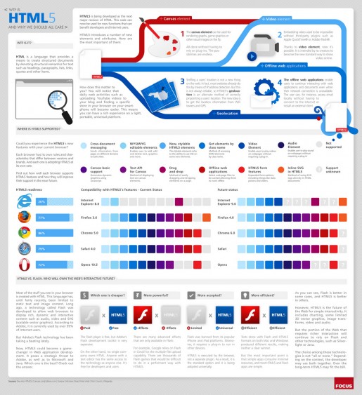
Does that clarify things? No? How about this handy info graphic:

HTML 5 infographic

HTML 5

So, what does it mean? Fewer plug-ins required for a rich web experience. Lighter weight web applications. A universal platform for developers. I like it.

If you want to see some HTML 5 coolness in action, check this out. Make sure you are using a browser like Chrome, Safari or Firefox (Sorry, Internet Explorer users, this one’s not for you). As well, you can check these links (Tom pointed to these in his excellent review of the new version of Safari):

Safari Technology Demos
Chrome Experiments

I think that HTML 5 has definitely raised the standard(s).

It’s FIFA World Cup Time!

One of the biggest sports in the world is being celebrated over the next month in South Africa (June 11 – July 11) – FIFA World Cup! Very cool. There is so much energy surrounding the world cup that even I am drawn in to the hype! I checked out fifa.com to see the teams, matches, and updates. If you want to know anything about what’s going on at the world cup, this is website to check out for sure. I like it. It’s going to be my online resource for all things World Cup for the next month.

I downloaded the Fan Guide to read for fun, and even the graphics are colourful and energetic – check out the logo. I especially like green-haired “Zakumi”, the official Mascot for the 2010 FIFA World Cup South Africa. He engages us to learn more about South Africa and its history, people, and football traditions. My favourite team? Well, Brazil of course!

—Kathy

Surfing the web with Safari 5

June is Christmas for fans of Apple Computer. This month is when Apple hosts their WWDC, the conference for sofware developers where they unveil their latest technologies and hardware for the next year. This year we’ve been blessed with a new iPhone design that is a significant improvement over last year’s model, but one of the headlines I’m most excited about as a web designer is the release of their Safari 5 web browser.

While I won’t be able to get my hands on the new iPhone before at least July, anybody is able to go to Apple’s website and download Safari 5 today and start using it for free. So strap on your pith helmet, and lace up your boots because we’re about to embark on a tour of Safari!

Continue reading →