What’s your Focus?

Although technology seems to advance at a relentless pace, photography seems to be one of those mediums that (in my opinion) is resistant to change. I mean clearly digital photography is rapidly replacing film, but I think there will always be a place for it – just look at polaroid. There are effects that can be achieved with film and old film cameras that have so much character. That being said, digital has made everyone a photographer.

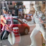
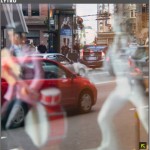
Now comes what could be the next step in the evolution of photography. These 2 photos are not 2 different shots with different settings  – they ARE the same photo. This is a new technology that allows you to adjust your focus after the photo has been taken.


“A company called Lytro has just launched with $50 million in funding and, unlike Color, the technology is pretty mind-blowing. It’s designing a camera that may be the next giant leap in the evolution of photography — a consumer camera that shoots photos that can be refocused at any time. Instead of capturing a single plane of light like traditional cameras do, Lytro’s light-field camera will use a special sensor to capture the color, intensity, and vector direction of the rays of light (data that’s lost with traditional cameras).”

See the rest of the article and more examples here.

What do you think? Is it as revolutionary as they claim?

Broken Design?

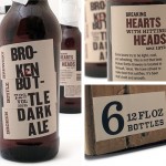
I came upon this design today at Looks Like Good Design.

At first it brought a grin to my face. Pretty clever packaging… Then as I thought about it – as cool as the aesthetic is, what would be involved in producing this?

Maybe that is the point. Maybe it is worth it to distress the cardboard and to add the tape, and to stick on the “broken” typography…

Ironically, perhaps it is the added care that has to go into creating the packaging that sets it apart. I like it, I just wonder if the expense justifies the concept. What do you think?

Now that is interactive

A clothing/fashion store opened last June in Times Square. What caught my eye was the way they created a billboard that not only drew a crowd, it (at least on some level) interacted with them. From NYClovesNYC:

“The enormous store provides Times Square with a high-tech 61-foot digital billboard featuring virtual models who interact with the mesmerized crowd in front of the store, sometimes taking a Polaroid photo of the crowd and showing it to them, or picking up an individual from a crowd and turning him into a frog by a kiss or dropping him into a shopping bag.”

Times Square Billboard

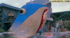
It kind of reminds me of the Jaws movie billboard in Back to the Future II

Did Hollywood have it right? Is this the future of environmental advertising – or is it just a gimmick?

– Shaun

Nice concept but…

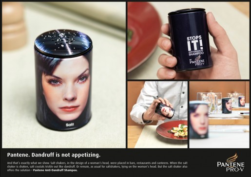
I saw this a few days ago:

I thought it was pretty clever at first–salt as dandruff–cool concept. Then I thought “Wait a minute, who is going to put that on their food?!” I mean, they put these in restaurants. What restaurant wants something so unappetizing on their tables? I can’t imagine how this would be good for business (at least for the restaurant).

To me, this is an example of a concept that although clever, just misses the mark. I would be interested to hear what others think.

A personal touch

With the advent of all things digital, have we lost some of the personal, handcrafted touches that were once common? Our communication in particular has become almost entirely email and/or Social Media based. I am not saying this is a bad thing, for it is extremely convenient, effective and efficient.  So how do we make our communication have more personality?

Well, if you are heavy into Facebook, there is always Pimp My Profizzle. It is a fun way to add some flare to your profile pic. But what about good-ol’-fashioned email. Is that boring signature just not enough? Pilot has found a way to take care of that.

I realize they are using this to sell pens, but what a cool idea.

As a designer I am always looking for ways to personalize things and communicate in a way (usually visually) that expresses something unique about someone or something. I wonder where that will take us next…

HTML 5 and why you should care

I have had some friends asking me about HTML 5. There has been a bit of buzz about it, so I thought I would address it and how it affects us as designers and others as clients and users.

According to Wikipedia:

HTML5 is currently being developed as the next major revision of HTML (HyperText Markup Language), the core markup language of the World Wide Web. HTML5 is the proposed next standard for HTML 4.01, XHTML 1.0 and DOM Level 2 HTML. It offers capabilities currently provided by plug-in-based rich internet application (RIA) technologies such as Adobe Flash and Microsoft Silverlight. In common usage, HTML5 may also refer to the additional use of CSS3, as both technologies are under development in parallel.”

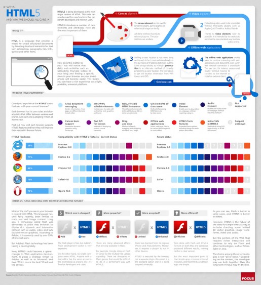
Does that clarify things? No? How about this handy info graphic:

HTML 5 infographic

HTML 5

So, what does it mean? Fewer plug-ins required for a rich web experience. Lighter weight web applications. A universal platform for developers. I like it.

If you want to see some HTML 5 coolness in action, check this out. Make sure you are using a browser like Chrome, Safari or Firefox (Sorry, Internet Explorer users, this one’s not for you). As well, you can check these links (Tom pointed to these in his excellent review of the new version of Safari):

Safari Technology Demos
Chrome Experiments

I think that HTML 5 has definitely raised the standard(s).

The Bike that would be King

OK it’s a hokey title – what can you do…

You may or may not know this, but I am a bit of a motorcycle fanatic (or a lot?). That is why I love the idea of a new business opening in Belleville. It is called BikeKing and it provides a place for gear-heads to work on their machines if they don’t have their own garage space. Cool!

Take a drive out Highway 2 just West of Belleville to check out the signage/branding we created for them.

While I’m on the topic of bikes, I might as well take the opportunity to share some my favourite motorcycle hangouts around the web. For the latest in motorcycle news I head over to The Kneeslider, and then Bike EXIF, and often Pipeburn.

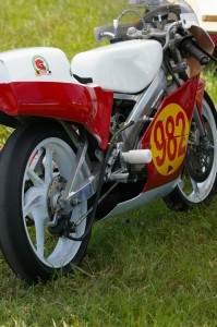
I was dismayed to discover that I missed the Vintage Road Racing Series at Shannonville this year. I thoroughly enjoy the races. My favourite part however is strolling through the paddocks with camera in hand to scope out all the incredible vintage machinery. Here are a few examples from last year:

Cafe Racer

My Favourite

Another Beauty

Number 982

Ducati

Some Italian Flavour

The Race

Drag the knee

Ahhhhh… maybe next year.

Logo design/redesign process

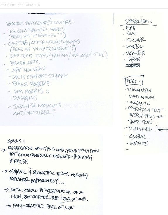
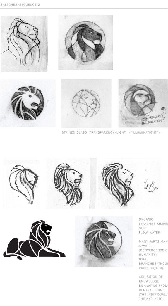
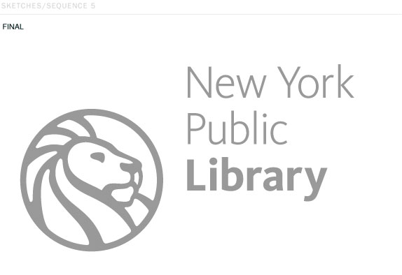
It is often surprising to see the process involved in creating things that we so often take for granted. My recent trip to the Black Prince Winery for example (during our 100 mile diet) opened my eyes to the process and science of wine making – fascinating stuff. On the flip side, I think people seldom realize what kind of process is involved in graphic design and logo design in particular. There are so many things to consider, company history, existing brand recognition, client’s taste, the business/organization’s values and the image they wish to convey.

Once you have gathered that information, the part begins – brainstorming, initial sketches, ideas, reducing all the abstract information into something simple, elegant and iconic, selection of typefaces/fonts, colours, refining the design, revisions, revisions, revisions…

So, for a real-world example of this process, check out the Brand New web site’s article on the New York Public Library’s logo redesign – I think you may be surprised.

nypl_logonypl_sketches_04nypl_sketches_02nypl_sketches_05

Architecture and Design

I know we (or at least I) tend to limit how we think of certain things. For instance, being a graphic designer, I tend to think of “design” in terms of print, web and sometimes packaging. I also have a love of /for interior spaces and architectural design. Then I will come upon an interior space, a building or informational display and I am blown away by the inspired design and creativity displayed.

One of the things that I love about creative thinkers, is that they can look at something old or generic and visualize it as the basis for something new and different. That is exactly what Zecc Architecten of the Netherlands did with this abandoned watertower.

“The water tower, which dates from 1931, was converted into an unparalled twenty-first-century home spread over nine levels.” That architects converted a watertower into a family home is not as impressive as how beautiful and unique a home they have created. Check out more here.

watertower-ext-02-601x900

Exterior View

watertower-ext-03-601x900

Exterior View 2


watertower-int-05-601x900

Interior - Kitchen and Staircase


1257283075-int-09-601x900

Interior - Bedroom and Staircase

Found at MOCO

Lego in Design

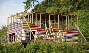
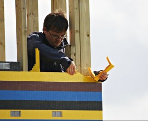
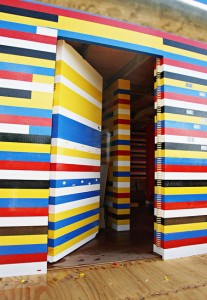
At the risk of becoming the resident toy geek, I can’t help but post this. Geeksugar has more on this house made of Lego. I used to do the same as a kid (on a slightly smaller scale).

Lego House

Lego House


Lego House - Brick Layer

Lego House - Brick Layer


Lego House Interior

Lego House Interior

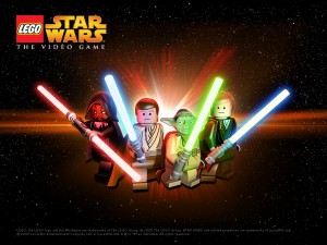
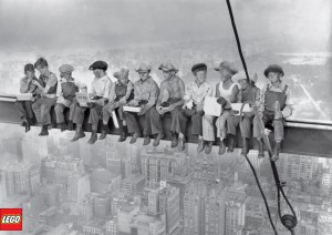
This made me think of how ingrained the Lego Brand has become. They have done a tremendous job of associating themselves with cultural icons. Here are just a couple of examples:

lego-star-wars-the-game

Lego Star Wars


Lego

Lego Iconic Imagery

For more info on the Lego House, check out this link.

Part of the reason we love this so much is that James May, one of the hosts of BBC’s Top Gear, is going to live in the house for a small stint (see above link for details). Bryna and I are big fans of Top Gear (and Black Adder, but that’s another story). In tribute to our admiration to James,  please enjoy this clip of the show.  (It’s not about Lego, but it’s an office favourite, and is a bit of a comedic take on marketing in general.)