
I came upon this design today at Looks Like Good Design.
-
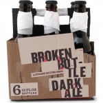
- Broken Bottle Dark Ale
-
- Broken?
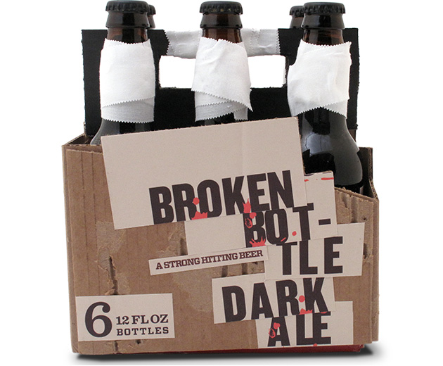
At first it brought a grin to my face. Pretty clever packaging… Then as I thought about it – as cool as the aesthetic is, what would be involved in producing this?
Maybe that is the point. Maybe it is worth it to distress the cardboard and to add the tape, and to stick on the “broken” typography…
Ironically, perhaps it is the added care that has to go into creating the packaging that sets it apart. I like it, I just wonder if the expense justifies the concept. What do you think?
{ Comments are closed! }