The following is a part of our One For the Creative Types Series. We are looking to help people transform their web presence from “starving artist” to “social media savvy entrepreneur.

I know for a fact that many artists do not see the same success online as they do at trade shows or other in-person events. Their ecommerce website has barely any sales, and visitors rarely go beyond the homepage. I know why—it’s because your website is terrible. Sorry, but it is likely true.
The most common reason why artists will see poor results with their website is that it was never a central focus. The website was likely created because everyone else had one, and not because it can be used as a tool to inform and sell. Well, you had the goal in mind to inform and sell, but you just posted it online and hoped for the best instead of taking control of the outcome.
It is very difficult to get all the information I am about to share with you when first attempting to do it yourself. There are a variety of solutions that can help you with your goals.
- Full-Service Agency
- Web design shop
- Freelance Designer
- Do-it-yourself
With obvious exceptions, I am a big believer in the motto, “you get what you pay for.” If you have the available funds and projections to make it economically viable, I would have to suggest going with a full-service agency. They have a strong understanding of the social web that goes above and beyond making a beautiful site. Their sites are designed to be functional and shared.
Thus far, we have discussed the basics of social media: A focus on relationships and the artist identity crisis. Building relationships and building an online reputation is all for nothing if you don’t have somewhere to bring potential clients or community members. You will be quickly forgotten.
Here are some beginning tips for online success:
Look Credible. Be Credible.
This goes without saying for an ecommerce site. I have been drawn to many websites where I have simply refused to purchase anything because I was not convinced the product would be delivered. How can you go about instilling trust with potential consumers? How do you look credible?
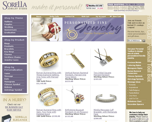
Here is an example of a site I stumbled upon and would trust my money with if I was searching for custom jewelry. I know, this is not exactly an artist website, but it has many elements that can be used as a benchmark for your website.

Here are some features that make me trust this website:
- Clean/organized layout
- Easy Navigation
- McAfee Secure
- 1-800 number (lame, but it helps me feel safe and able to ask questions)
- Multiple payment methods including Paypal
- Customer Reviews
- Social Media Share buttons
This may look a little too “corporate,” and there are ways even this website can improve, but you get the point. Who knows, maybe you aren’t even going the ecommerce route.
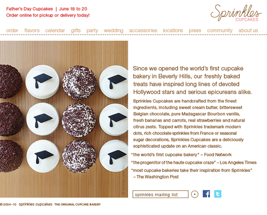
Here is another benchmark in my mind. Sprinkles was voted the top cupcake bakery in the US. This proves that your website does not need to be over the top to be credible looking.

Here is a simple checklist to get started on an effective website:
- Credible
- Appealing to your target audience
- Easy to Navigate
- Easily Updated
- Link to your social networks
- Search engine friendly
- Link internally and externally
- Media that engages viewer (images, etc)
- Blog (optional)
Next week I will be talking about Social Media Platforms to Share your Work – what’s worth using, what’s a waste of time? (Blog, Facebook, Twitter, LinkedIn, Flickr, Youtube, Deviant Art, Etsy, MySpace, Myartspace)


Hi Bryan, Great points to remember while working on the layout for an eCommerce website, I think making it credible, easy to scroll through and still eye-catchy is the way to
rock.
Credibility comes from testimonials, social mentions can also be sported on the site, Great usability can be achieved by doing a research on other great websites and the eye-catchy factor can come from the right portrayal of your offerings.
Shopify is a great tool to design fabulous eCommerce destinations, worth checking out.
Thanks for shipping your thoughts…
Probably the best online shopping experience I've had was at http://www.adagio.com/
I think the issue with most artists is that they are too demanding or controlling, yet lack the skills to make their own site. I think it would be like taking pictures of a painter – clearly the painter has his own ideas about composition of the images and what he wants to see, but lacks the technical skill to take the photos himself.
I'm not pointing fingers or blaming, I just see this in myself as a designer (whern it comes to getting pictures taken) and I've seen it in other artistic people around me.
I think what artists need to do is relax, hire a professional, and then TRUST that professional (otherwise you wouldn't have hired them right?) If everybody extended the same professional courtesy to others are they expect themselves I think there would be a lot better design out there (web or otherwise).
Web design is a skilled trade, and even if you understand how the fundamentals work, unless you're a trained tradesman you can't do that you think you can do. I know pipes screw together, and I know water flows through them – but I don't fancy myself more knowledgeable than a plumber. Obviously the plumber is taking FAR more into consideration (width of pipe, type of pipe, flow of water, pressure, types of seals) that I don't have a clue about.
Just my 2¢, unfortunately I get to see both sides of this coin all the time with my friends and colleagues.