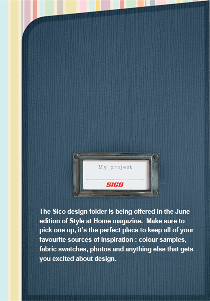
 I’ve been wanting to change the colour of my fireplace for a while now. As I was flipping through the newest issue of Style at Home magazine, I saw an interesting advertisement for Sico paints called “My Project”. It actually engages the reader – there is a scrapbook folder inserted into the magazine which you can pull out and keep to help organize all your ideas for your next design project. Visit www.styleathome/sico to view the folder. It got me thinking.
As a designer, the first place I turn to for colour is the Pantone swatch book. A couple of years ago I chose a spot colour pms #4515, which is equivalent to Benjamin Moore’s “Sombrero”. This time I’m thinking of going a little more dramatic and picking pms #404, or Benjamin Moore’s “Mortar” or “Nordic Grey”. Check out the 2010 – 2011 paint colour trends at www.benjaminmoore.com and www.sico.com.
Colour trends shift constantly, just like anything else, so it is important to keep up to speed on what’s new in colour. Sometimes I like to source www.colourlovers.com for fresh new colour combinations for print media. A good site for picking complimentary colours is http://colorschemedesigner.com. The Pantone website www.pantone.com also has colour library updates at your disposal. All you have to do is become a member.
Designing for your home is kind of like print design – creating a harmonious and effective colour palette is important.
—Kathy


As soon as I saw the title I was going to comment on Colourlovers — glad you tackled that. That is one of my favorite sites – it is great.
Unique post – love it Kathy
… and thank you for introducing me to colourschemedesigner! I love the compliment setting ! AMAZING
That's great, Bryan! Thanks for your comments. I love colourlovers too.
Interesting links. Thank you!
Thanks, Ken. I'm going to buy my pms spot colour paint this weekend. That's the easy part – it's the painting I'm not so good at. Isn't there a real-life Photoshop tool for that?