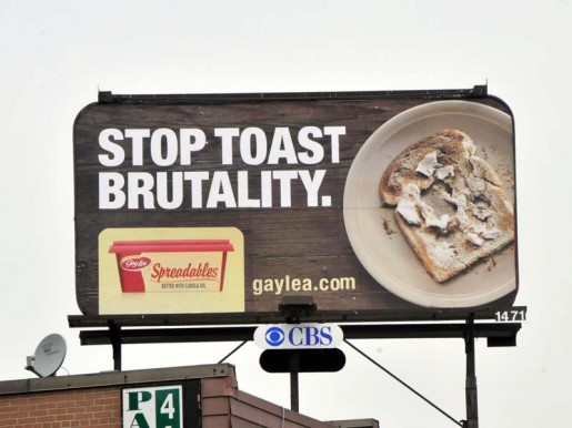
I was driving home from work the other day and I laughed out loud when I saw a billboard for Gay Lea Spreadables. I had to pull over and take a picture of it! Take a look – who hasn’t had this happen to them? Too funny. I was curious and checked out their website gaylea.com. They have a sponsorship program on now which supports the Daily Bread Food Bank – a non-profit, charitable organization that is fighting to end hunger in our communities. You know, it’s not the first time I’ve been impressed by a billboard on my way home from work.
 Print media isn’t just limited to the office. Out-of-Home products such as posters (or billboards), superboards, transit shelters, wall murals, bus, subway and streetcar advertising are all powerful ways of reaching today’s consumer. CBS Outdoor is who we send all of our outdoor billboard designs. For information on any of the products they have please visit cbsoutdoor.ca
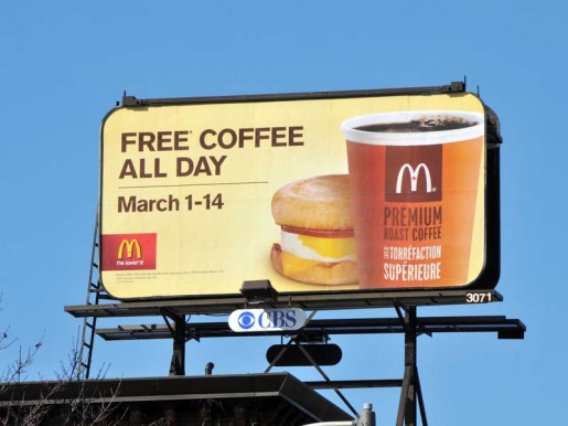
I remember one billboard in particular that proves the effectiveness of strategic planning when it comes to choosing a location. A few months ago, McDonald’s was advertising FREE COFFEE when Tim Horton’s had their “Roll Up The Rim” contest on. The billboard for the free coffee was located right across the street from a Tim Horton’s. I thought that was genius! Needless to say, I went to McDonald’s for my coffee those two weeks (and maybe a couple of lunches). I even went onto their website and was reading about their nutrition information and community involvement, and I now have a better opinion of the restaurant chain. Tim Horton’s has similar information on their website, and the Gay Lea website has an environmental sustainability report available to view. It’s nice to see large business caring about their community.

Billboards speak to each consumer differently. What I find funny, or smart, might seem silly to someone else. That doesn’t matter, however. The fact remains that the billboard DID speak to me, and I’m still thinking about it! Have you seen any unique billboards lately? I’d like to hear about it.
If you’d like to see the billboards Engine has designed, you are welcome to view our portfolio online.


Billboards have to be read fast to be effective and sometimes packing humour into such a short (and expensive) space gets overlooked – but driving can be stressful and anything to lighten the mood is really appreciated and inspires warm feelings toward that brand.
I'd love to see more messages to motorists and humour on billboards than advertising – I think billboards would be more effective as communicating brand values than trying to sell individual products, although the public awareness thing like the McDonalds coffee campaign worked well!