Consistency
Posted on Friday, August 7th, 2009 at 11:16 am by Engine Communications

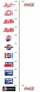
Pepsi and Coke logos
Coca-Cola – one of the most recognizable logos in the world – is a beautiful example of consistency in branding.
If you attended our Marketing/Branding Seminar in June you would have heard us reciting the consistency mantra. Hey, if it worked for Coke…
This entry was posted on Friday, August 7th, 2009 at 11:16 am by Engine Communications
and is filed under Advertising, Design, Marketing, Typography.
You can follow any comments to this entry through the RSS 2.0 feed.
Both comments and pings are currently closed.


yes, but this fails to take into account the whole grey period between when the coke logo was original and when it became classic. the move to classic takes decades, many of which i would argue leave a logo looking extremely dated and dull.
it also fails to take into account how much faster the world now evolves. look at the dated original logos of google, microsoft and palm. (http://www.neatorama.com/2008/02/07/the-evolution-of-tech-companies-logos/) how long do you think it will be before they begin to look classic?
consistency over a few years is one thing. sticking with one brand look over decades, especially today, would be a mistake
(full disclosure: yes, i am a pepsi guy)
Slight variation on that theme 😉 http://www.underconsideration.com/brandnew/archives/coca-cola_vs_pepsi_revised_edition.php